FDA rebrands, unveils new logo
The Food and Drugs Authority as part of its re-branding initiative has introduced a new logo.
According to FDA, the re-branding of the authority and the new logo, reflect the renewed purpose of the authority as well as reflecting the regulatory body’s expanded operations, values and regulatory philosophy.
In a statement posted on the FDA’s Facebook wall said “The re-branding will breathe new life into our authority’s public interface”.
“As an organisation that believes in innovation we felt the need to refresh our identity with a new logo that speaks to our values and one that is simple and clear. The rebranding will breathe new life into our authority’s public interface. It will position FDA as an evolving brand that moves with the times and remains relevant in a changing business environment. FDA recently celebrated its 20th anniversary so the new logo and brand identity reflect its renewed purpose for the future; reflecting the FDA’s expanded operations, values and regulatory philosophy.”
The FDA also added that their rebranding efforts will spur on the authority to improve on their service delivery adding that the authority will continue to improve on their service delivery to Ghanaians.
“With this new look, we want to assure Ghanaians that, their foods and drugs are in safe hands.” The statement said.
“FDA remains the regulatory body for food and drugs administration in Ghana and continues to improve on their service delivery. The authority expects the brand refresh to drive an similar improvement in attitude and behavior of staff.” The statement added.
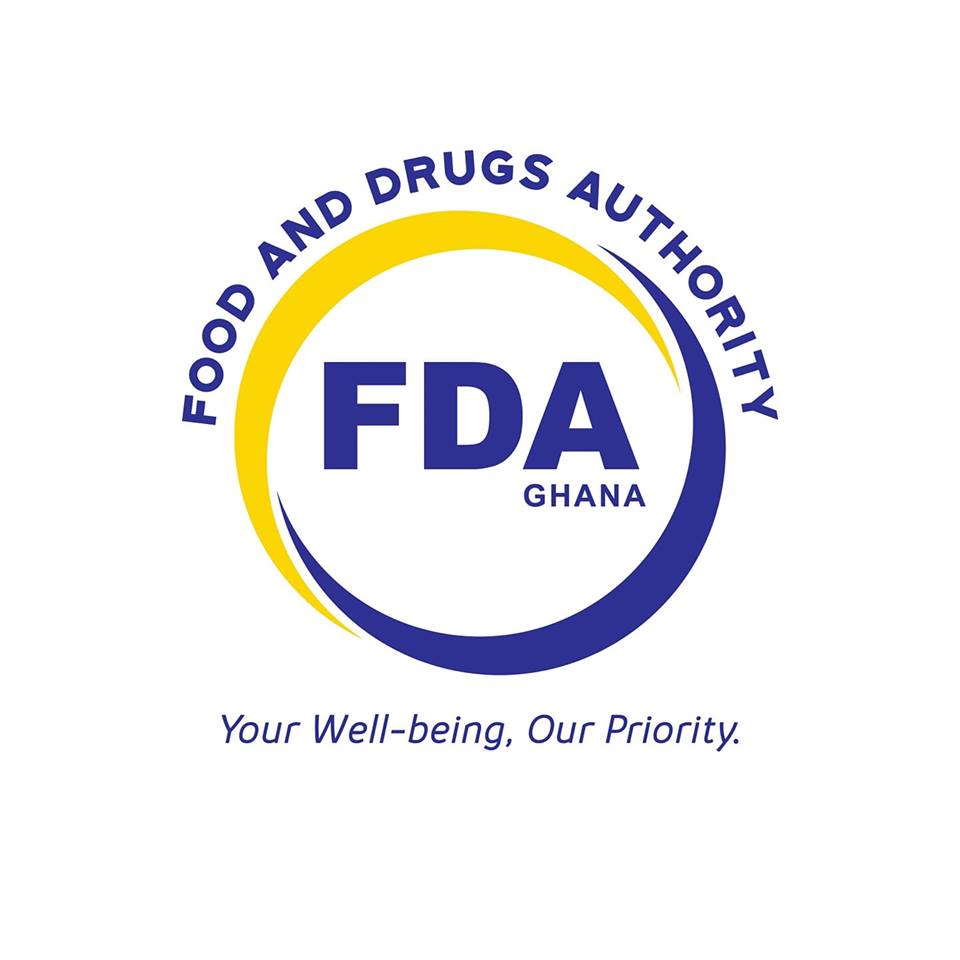
The New FDA Logo
The logo consists of two arcs in yellow and blue which form a circle around the acronym, “FDA”, which is also spelt in full in the shape of an arc above the circle.
The interlocking arcs symbolize FDA’s willingness to embrace engagement with stakeholders. The full circular shape of the arcs represent the complete 360 required checks we conduct to ensure consumer well-being. Within the circle, “Ghana” sits beneath the A of FDA to specify the geographical location of the brand.
‘Use your new brand to reinforce core values’ – First Lady to FDA
The First Lady of Ghana, Mrs. Rebecca Akufo-Addo charged the Food and Drugs Authority to focus its rebranding agenda towards safeguarding the ultimate interests of Ghanaians.
She disclosed this yesterday, April 16, 2019, at the unveiling ceremony of the new corporate image of the Food and Drugs Authority in Accra.
According to Mrs. Akufo-Addo, this move by the FDA will entrench the personality of the new brand.
She said, it is also envisaged that the re-branding will help to revitalize the FDA brand and reposition the FDA, to appeal to a wider public and boost the understanding and acceptance of its role.

The First Lady said malnutrition, food hygiene and unwholesome products remain critical to the broader agenda of ensuring a healthy productive population.
This, she said is why the Food and Drugs Authority has proven to be one of the most powerful regulatory institutions in Ghana.
“Not too long ago, the herbal industry was not regulated. Anyone could produce and package products in any form and sell it anyhow they wanted. The story is different today. We all bear witness that, there is an appreciable level of certainty and regulation in the herbal medicinal and beverage industries.” She said.
While congratulating the FDA’s contribution to national development, Mrs. Akufo-Addo called on them to resist any practice that will undermine the new corporate brand and forge an institution that will stand the test of time.

Source: citifmonline.com
Source:
Citi Newsroom


Popular Posts


Scroll to Top